Identifying Stationarity for a Pairs Trading System
A series of articles on using cointegration in a pairs trading system - Part 2 of 3
- Martyn Tinsley
- /
-
Abstract:
- Part 2 of our plain English guide to using cointegration within a pairs trading strategy demystifies the process of identifying stationary time series.
This is Part 2 of ‘Cointegration for Pairs Trading’. I recommend you read Part 1 before continuing, so that you understand the differences between correlation and cointegration, and why that’s important for pairs trading.
In this part we cover the concepts of stationarity and why this is important to identify cointegrated pairs before attempting to use a pairs arbitrage trading system.
Use with trading systems
This series of articles is not intended to cover the details of trading systems and strategies specifically, but rather concentrates on the principles and calculations for cointegration which you will need to understand regardless of the pairs trading system you choose. However, I do cover in passing potential systems that you might consider worthy of further investigation.
Correlation versus Cointegartion deep dive
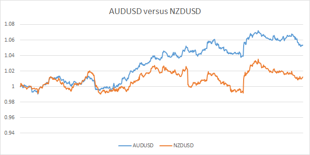
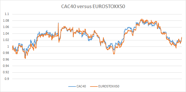
So let’s move on, and take a closer look at the two examples we used last time. I stated that both the AUDUSD/NZDUSD pair and also the CAC40/EUROSTOXX50 pair were correlated to some extend but only one (the latter) was cointegrated during the period we focused on. Let’s remind ourselves of the two charts shown in part 1.
I’m the kind of person that likes to really understand what is happening with the underlying price action. To get this deeper level of insight into what’s going on it is often useful to look at a scatter plot of the price action. So let’s now do this for each of the pairs we are studying. This helps with our understanding of the relationship between each instrument in the pairs.
These scatter charts are created by simply plotting points where each x value represents the price for one instrument and the y value represents the price of the second instrument at the same point in time.
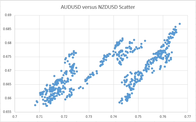
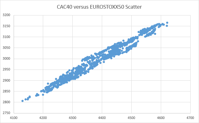
Clearly, despite the fact that both pairs show signs of correlation, the two scatter charts show some very different behaviour.
In this case of the correlated pair's (AUDUSD / NZDUSD) scatter chart, this shows 3 distinct areas, or ‘clusters’, each with some form of linear relationship. Although CAC40/EUROSTOXX shows some evidence of distict patterns (if you look very carefully), broadly speaking it is far closer to having a single linear relationship. A further difference is that even when you consider just one of the clusters of AUDUSD/NZDUSD, ignoring the other two, they are not as well defined as the whole of the CAC40/EUROSTOXX plot.
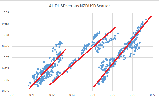
The three distinct patterns seen for AUDUSD/NZDUSD result from the fact that they exhibit signs of a positively correlated linear relationship for periods of time (where the ratio of the prices of the pair stay relatively constant), but then occasionally, the two instruments move apart (maybe in this case because of differing reports/forecasts of their respective country’s economic data), but are not subsequently ‘pulled back together’ again. And that is the key point here – they don’t get pulled back, but rather start exibiting a alternative linear relationship (with a different ratio). The fact that they don’t get pulled back together is because they are not cointegrated over longer time periods. If we look back at the original normalised price chart for AUDUSD/NZDUSD, one such time where there is a fairly major and sudden divergence in the ratio, is highlighted in red, where NZDUSD shows a sudden fall in value whereas AUDUSD does not follow with the same magnitude.
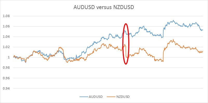
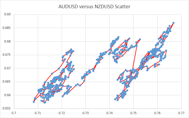
This sudden jump causes the scatter chart to jump from one cluster to the next. An extension to the scatter chart shows the ‘path’ and order of ratio changes and highlights exactly when these jumps between clusters occur.
It is this type of major shift that I believe the breakout pairs trader I mentioned in my intro, was alluding to (if I have understood him correctly). This is certainly a system I have put into my to-do list for future research.
So now that we’ve started to understand some of the underlying characteristics of how the instruments in different pairs relate, next we need some way to be able to measure this reliably and quickly. So although the qualitative analysis above might have been interesting and insightful, we don’t want to waste time going through the process for every candidate pair, right? Furthermore, we need a way of measuring this quantitatively and precisely, so that we can easily compare the cointegration of many pairs, to decide which might be the best candidates for our trading system.
To be able to do this however, we first have to understand two concepts. Firstly we will look at something called ‘Stationarity’ and secondly a formal test for stationarity, called a ‘Unit Root Test’. Don’t worry if you don’t know what these are. All will be explained.
Stationarity
Most articles that explain stationarity, jump straight into mathematical equations. But I want to live up to my promise of keeping this article simple an understandable for the masses. I love maths, but I love pictures too. So although I will get into some of the maths in a moment I want to first ‘show’ the reader what stationarity and non-stationarity ‘look like’ so that you will hopefully pick up the concept more easily.
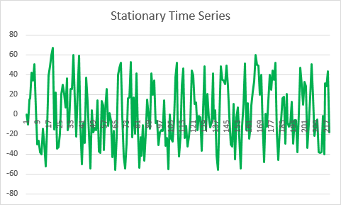
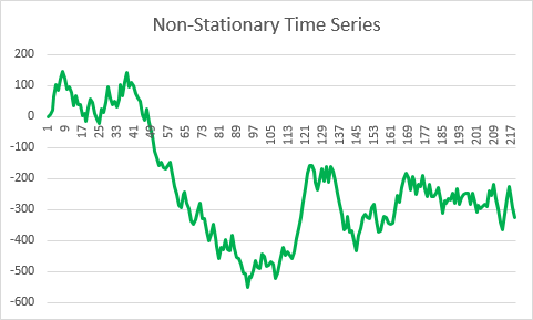
The main and simplest definition of a stationary time series is where its ‘mean’ stays constant over time. A further criteria is that the variance also stays constant over time. Although not strictly true, think of variance as being like the amplitude of a wave form if that helps. So looking at the chart above for the stationary time series, you should be able to see through simple observation that the price keeps returning to its mean. Compare this to the non-stationary example (which in this case is based on a ‘random walk’) where the mean clearly changes over time.
Now there are more complex forms of stationarity such as when the stationary behaviour is combined with a trend but let’s keep this simple for now.
So the key take-away point to all of this is that the stationary series continually gets ‘pulled’ back to the mean whenever it temporarily moves away. To put this another way, a stationary series exhibits the property of mean reversion. Conversely, a non-stationary time series (e.g. a random walk) does not show any evidence of mean reversion.
A stationary series exhibits the property of mean reversion. Conversely, a non-stationary time series (e.g. a random walk) does not show any evidence of mean reversion.
We’ve reached the point where we do have to get into the maths behind this concept of stationarity. We'll take this step-by-step in Part 3
